We don't have a CAPTAIN AMERICA thread??? Well, we do NOW.
I'm trying to put together some coloring samples, and I figured it would be good if I had a variety of artists. So, a quick look around at what was on my computer, and here was this wonderful GRAY MORROW page.
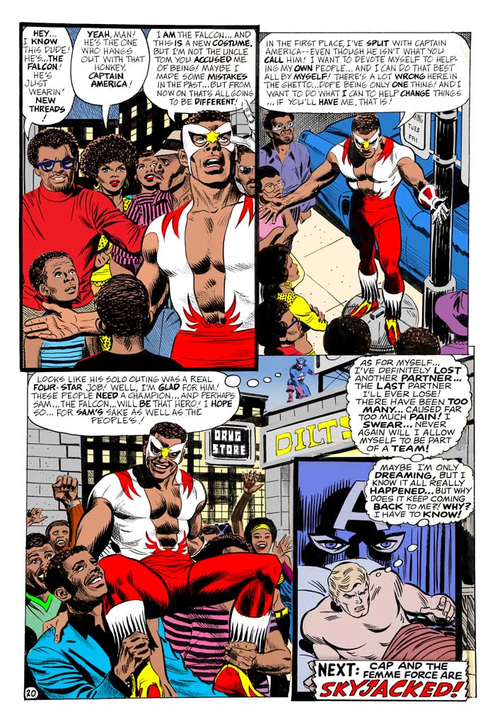
Once again, I did not bother to dig out the comic. the colors you see here are ALL my own choices!
http://3.bp.blogspot.com/-7A344p_GGFc/TriIEmb1ExI/AAAAAAAAARQ/YzEg41eqMuc/s1600/CA+144_p20a_HK.jpg
Replies
That last panel looks more like John Romita than Gray Morrow.
And Jeff of Earth-J has a great Captain America thread going!
Not only is the last panel a John Romita paste-up, I'm convinced the dialogue in that panel is Stan Lee at his WORST. (He was still editor for another 9 months before Roy took over). It's intrusive, it's totally at odds with the rest of the page, and the lettering doesn't even match. I'm wondering if it originally didn't just have 3 panels on that page, with the final panel taking up the entire bottom half of the page, with more neighborhood people marching along celebrating The Falcon as their new hero.
I did a SEARCH for Captain America and couldn't find a specific thread!
That whole story is an odd one. It's supposedly the second chapter in the story, in which Cap, Sharon and Fury fight Hydra (and palaver with Nixon) in the first part. Then Fury tells the two lovebirds to take time off and Sharon asks Steve if they can. He says he'll think about it after he gets a good night's sleep.Art by Romita.
This dream includes thought balloons for Sam and Cap, plus a long discussion between them and Sam unveiling his new Falcon costume. Then Sam goes off to bust up the pusher-man and be hailed as a hero by everyday folk, the page you've got, and Cap wakes up.
It's a strange layout if there was no final panel there, but it's an odd structure in any event. Why tell it as a dream? Why not just them confronting each other, which apparently happened but Cap is just dreaming about the event?
Take away the first page and that last panel, and it's a straightforward story. Maybe Stan decided to play it that way so it could seem to have happened earlier, and they redid the original opening to make it a dream. OTOH, maybe Morrow forgot to wrap up the "dream" aspect, so they tacked on that last panel to bring it back to how it started. Either way, it's pretty strange.
Your coloring is pretty nice, if a little brighter. The biggest changes are that Falcon-red turtleneck on the guy in the first panel, which was a muted purple/gray in the comic, and the bright blue suit on the guy holding up Falcon in panel 3, which was a yellow/tan. The car also is a muted greenish-gray.
The drugstore and Dilts sign were red on yellow, spotting some red over in that direction, and the building was Cap blue (as was Cap's head in the final panel). They probably wanted darker colors both because it was night and to make Sam's bright colors stand out.
-- MSA
I've got the original comic, I just didn't wanna bother digging it out. I figured to see what I could come up with without any reference. I think I mainly made Rafe's turtleneck red so he'd draw your eye more than the rets of the people, as he was such a loudmouth.
I 'd forgotten that chapter started with Steve having a dream.
The previous issue, #143, was the one where they went double-size, and had 34 pages by John Romita. #144 was originally scheduled (like many the next month) to also be double-sized, but Martin Goodman cut things back to regular size instead. If it had been double-sized, #144 would have had 3 chapters, each by a different artist.
"Hydra Over All!" -- John Romita (10pp)
"The Falcon Fights Alone!" -- Gray Morrow (10pp)
"Skyjacked!" -- Gil Kane (14pp)
Instead, the Gil Kane chapter opened #145, and the last 7 pages were by Romita. #146 had 2 chapters, both by Sal Buscema, which no doubt would have appeared in #145 if not for the format reversion. I'm guessing they hadn't worked that far in advance, and adjusted a lot, because no combination there works out to 34 pages...
I hadn't realize it for decades, but Sal Buscema really made his debut on the series on CAP #114-115. He did pencils AND inks, the first issue over John Romita layouts, the second over John Buscema layouts. (John layouts-Sal pencils & inks looks a LOT different than John pencils-Sal inks.) The credits were so vague & deceptive, I hadn't really noticed what was going on there before.
When Romita decided to move on (or was it just back to Spidey again?), it was mentioned that Gil Kane was scheduled to take over CAP (just as he was also mentioned at one point as scheduled to take over SUB-MARINER). Kane never did a Subby episode (except in MARVEL TEAM-UP), and he only did 14 pages of CAP. I bet it was quite a surprise when Sal Buscema took over the book, and did a rather long & consistent run. Just as with George Tuska on IRON MAN, and Herb Trimpe on HULK, Sal caught a lot of hell from readers on CAP. And yet, when I started buying the new issues regular, these were the guys doing the books, and looking back, it's impossible to think of the early 70's without those guys. Sal has never been a favorite of mine, but to this day CAPTAIN AMERICA is my favorite work by him.
Here's a page by Frank Robbins & D. Bruce Berry from CAPTAIN AMERICA #191. To some extent, I tend to think Robbins has a "fun" style, though I'm convinced he was totally wrong for doing superheroes.
I read Captain America #4 today. I love that artwork, and the story is downright eerie. I love the reality-hopping going on--this is a kind of new thing for Brubaker's Cap, but a welcome addition to this version of the character.
I hated Robbins while he was on Cap and The Invaders, but in later years I really began to appreciate his style. To this day, he is the Invaders artist for me.
Henry R. Kujawa said:
Surprisingly, Robbins-Colletta wasn't bad. But Robbins-Springer was HORRIBLE.
I didn't mind Kupperberg-Stone (and I usually HATE Kupperberg!).
I was recently thumbing thru the INVADERS ANNUAL, and found I liked ALL the different artists' work on that (especially the cover by Alex Schomberg), except for Robbins-Springer. I kinda wonder how it might have been if Robbins had inked his own work?
Mr. Silver Age said:
The splash page would be a fairly ordinary opening for the period if the story continued with Steve waking up and getting up. Possibly this was how the story was originally planned, and it was turned into a dream of Steve's through the dialogue and additional panel to slot it behind the opening piece. This isn't an unproblematic theory, though. (For example, it only works if there was originally a "Steve wakes up" sequence which has been dropped. I'm assuming there are no further indications that Steve is dreaming in the art on the second page.)
The story can't have been waiting around in a drawer forever since it introduces the Falcon's new costume. Incidentally, the new costume was used for the logo Falcon on the preceding issue (his first appearance in the logo).
As I said, I figure #144 was intended to be the 2nd double-size issue, with 3 chapters, one each by 3 different artists (Romita, Morrow, Kane). But when the decision was made to return to normal-size, the Kane episode got bumped to the following month. Which means the last page of the Morrow chapter suddenly became the final page of the issue.
The excessively-melodramatic dialogue in that last, pasted-on panel is SO awful and out-of-place. And, it doesn't read anything like Gary Friedrich (who is usually his own kind of badness-- heehee). But it does read exactly like Stan at his worst. Stan can be extrememly good when he's on his game.. but when he's bad, run for the hills!
-
1
-
2
-
3
-
4
of 4 Next